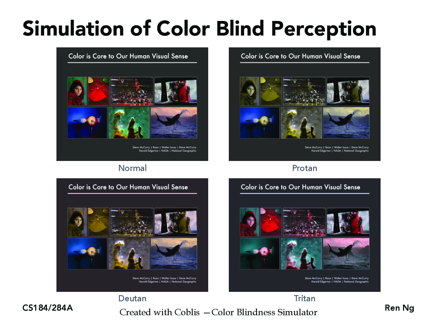
Looking into colorblindness, I learned that many services use WCAG color contrast scores to account for colorblindness and readability. Given a foreground color and a background color, it computes a ratio that can be used to assess how readable a text is on the background. Compliance with this can be useful for ensuring that colorblind users can have a pleasant UX.
modatberkeley
How do we know that these are the colors that colorblind people see? What was the process to measure how they perceive the world and compare it to our "normal" vision when colorblind people have no "normal" as a baseline to compare with?
waleedlatif1
@modatberkeley So to identify color blindness, theres actually a really cool test called the Ishihara vision test, which basically tells the participants to identify the color on a series of plates with different things embedded in them. For those who are not colorblind, they are typically easily able to identify the colors, but impossible to identify if you are colorblind. Based on which plates are correctly identified, the researchers decipher what type and the severity of the colorblindness. To answer your question, I don't think there is a baseline that they can compare to for colorblind individuals because like you said, they are unable to compare it to normal color vision.
joeyhou0804
I wonder how will a color-blind person sees these pictures. Will they see two identical pictures (the one which corresponds to their color-blindness and the original one) or will they see anything different?
Staffyirenng
Thanks for your discussion! See my comments on other slides with similar discussions / questions.
Looking into colorblindness, I learned that many services use WCAG color contrast scores to account for colorblindness and readability. Given a foreground color and a background color, it computes a ratio that can be used to assess how readable a text is on the background. Compliance with this can be useful for ensuring that colorblind users can have a pleasant UX.
How do we know that these are the colors that colorblind people see? What was the process to measure how they perceive the world and compare it to our "normal" vision when colorblind people have no "normal" as a baseline to compare with?
@modatberkeley So to identify color blindness, theres actually a really cool test called the Ishihara vision test, which basically tells the participants to identify the color on a series of plates with different things embedded in them. For those who are not colorblind, they are typically easily able to identify the colors, but impossible to identify if you are colorblind. Based on which plates are correctly identified, the researchers decipher what type and the severity of the colorblindness. To answer your question, I don't think there is a baseline that they can compare to for colorblind individuals because like you said, they are unable to compare it to normal color vision.
I wonder how will a color-blind person sees these pictures. Will they see two identical pictures (the one which corresponds to their color-blindness and the original one) or will they see anything different?
Thanks for your discussion! See my comments on other slides with similar discussions / questions.