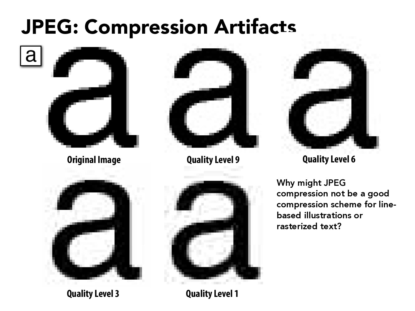
JPEG compression might not be a good compression scheme for line-based illustrations or rasterized text because these artifacts are especially visible in the white space in the letters.
waleedlatif1
Firstly I want to mention that I've experienced this many times trying to convert to JPEG and getting something that looks significantly worse.
One instance in which JPEG compression might not be a good compression scheme is when the image is low resolution or has already been compressed heavily. Also, if I am changing the size of the rasterized text by a significant amount, then I may experience degradation in quality because from my understanding, higher resolution images typically require less compression to maintain quality.
richardzhang0610
I think one explanation for this is that JPEG use a 8x8 square rather than a rectangle.
StaffDanCubed
Could it be because that JPEG compression downsamples the chroma space, and the effects of which is particularly visible in black and white? At lower quality levels we see these small black patches around the letter, which from my understanding is because the downsampling from JPEG essentially "mixed up" the colors slightly. When looking at a colorful image this effect might be very hard to notice, but when it is black against white even a small spot will be very visible to the eye.
kkkhanl
It's interesting to see that with the compression black spots start to appear in large areas of white, why does this actually occur?
wangdotjason
JPEG is a lossy image compression format that is designed to efficiently compress photographic images, which have smooth color gradients and complex patterns. However, text is different from photographic images in that there is typically very high contrast, making the compression look blurry and distorted.
JPEG compression might not be a good compression scheme for line-based illustrations or rasterized text because these artifacts are especially visible in the white space in the letters.
Firstly I want to mention that I've experienced this many times trying to convert to JPEG and getting something that looks significantly worse.
One instance in which JPEG compression might not be a good compression scheme is when the image is low resolution or has already been compressed heavily. Also, if I am changing the size of the rasterized text by a significant amount, then I may experience degradation in quality because from my understanding, higher resolution images typically require less compression to maintain quality.
I think one explanation for this is that JPEG use a 8x8 square rather than a rectangle.
Could it be because that JPEG compression downsamples the chroma space, and the effects of which is particularly visible in black and white? At lower quality levels we see these small black patches around the letter, which from my understanding is because the downsampling from JPEG essentially "mixed up" the colors slightly. When looking at a colorful image this effect might be very hard to notice, but when it is black against white even a small spot will be very visible to the eye.
It's interesting to see that with the compression black spots start to appear in large areas of white, why does this actually occur?
JPEG is a lossy image compression format that is designed to efficiently compress photographic images, which have smooth color gradients and complex patterns. However, text is different from photographic images in that there is typically very high contrast, making the compression look blurry and distorted.