Lecture 7: Intro to Geometry, Splines, and Bezier Curves (16)
austinapatel
I was curious to learn more about the rendering process for fonts. I discovered that there are three types of fonts: bitmap (pixel grid that works well for fixed text sizes), vector (using Bézier curves as shown on slides) and stroke fonts. Vector fonts typically look the best as they can scale to any size, but they are more computationally difficult to render compared to bitmap fonts. More details can be found here.
joeyzhao123
I thought this was very interesting. I never gave too much consideration to fonts and how some fonts looked great when being scaled up. The math behind how it's created makes a lot of sense for how smooth it does look.
waleedlatif1
Does the use of Bézier curves in vectorized fonts that are able to scale freely have to do with the popularity of some fonts over others? Fonts like Helvetica are drastically more popular than others. After doing some research on my own, I found out that Helvetica and often other popular fonts have a whole art behind them called type design that heavily relies on the use of Bézier curves.
patrickrz
this slide made me realize that Bézier curves are used in common graphic design tools like Illustrator/Figma; they prevent the need to draw by hand while still being able to have the flexibility to create non-geometric shapes
a further dive online reveals how these curves also support the outlining of animation paths, another application of computer graphics
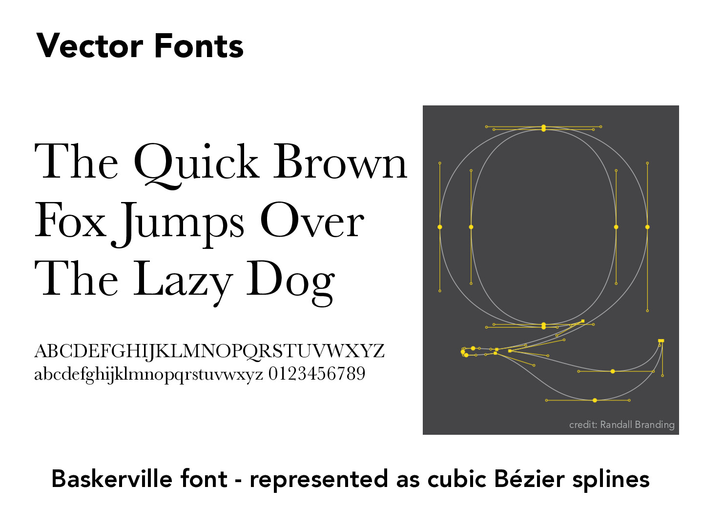
I was curious to learn more about the rendering process for fonts. I discovered that there are three types of fonts: bitmap (pixel grid that works well for fixed text sizes), vector (using Bézier curves as shown on slides) and stroke fonts. Vector fonts typically look the best as they can scale to any size, but they are more computationally difficult to render compared to bitmap fonts. More details can be found here.
I thought this was very interesting. I never gave too much consideration to fonts and how some fonts looked great when being scaled up. The math behind how it's created makes a lot of sense for how smooth it does look.
Does the use of Bézier curves in vectorized fonts that are able to scale freely have to do with the popularity of some fonts over others? Fonts like Helvetica are drastically more popular than others. After doing some research on my own, I found out that Helvetica and often other popular fonts have a whole art behind them called type design that heavily relies on the use of Bézier curves.
this slide made me realize that Bézier curves are used in common graphic design tools like Illustrator/Figma; they prevent the need to draw by hand while still being able to have the flexibility to create non-geometric shapes
a further dive online reveals how these curves also support the outlining of animation paths, another application of computer graphics