How exactly should we read the graph in the bottom right corners? What do the different colors represent, and what are the x/y axis representing?
pixelled
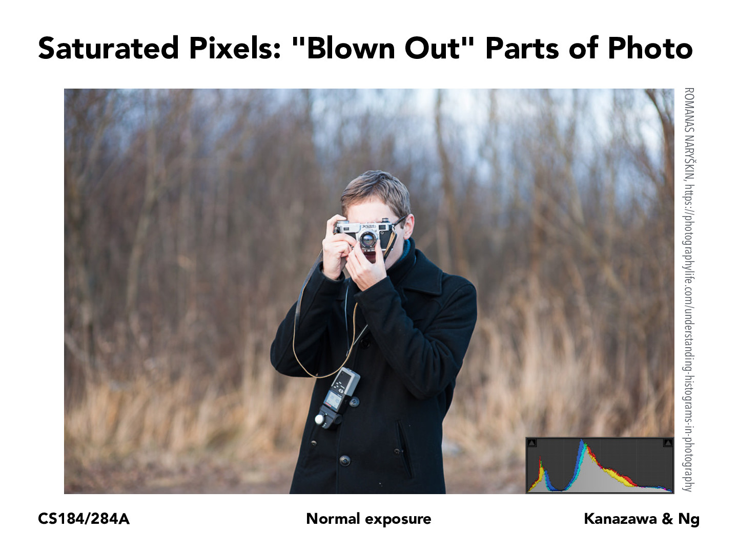
The graph at bottom right is a histogram of the number of pixels at increasing intensity levels on the horizontal axis. For this photo, it's pretty balanced and most pixel values are in the middle of the histogram.
How exactly should we read the graph in the bottom right corners? What do the different colors represent, and what are the x/y axis representing?
The graph at bottom right is a histogram of the number of pixels at increasing intensity levels on the horizontal axis. For this photo, it's pretty balanced and most pixel values are in the middle of the histogram.