There is higher contrast and deeper blacks in P3 as it displays up to 25% more color depth.
Staffjamesfong1
@rsha256 Check the gamut of the display you are using. If it does not support P3, then you won't be able to see the difference because the display physically cannot show you those colors.
saltyminty
I can see the higher contrast/deeper blacks mentioned by estherc123 in the flower photo, but the two reds look the same to me; is that intended?
Noppapon
As other comments pointed out, the flower image in P3 looks more vibrant and has higher contrast. On the other hand, the two reds look the same. I believe this should be the case due to how the color red falls within the gamut of both color spaces; therefore can be accurately presented in both sRRB and P3.
Staffyirenng
Hmmm. I don't see differences either in the webpage image to the left. The red image should show a visible icon in the P3 version only.
Try downloading the PDF -- the differences are clear to me there.
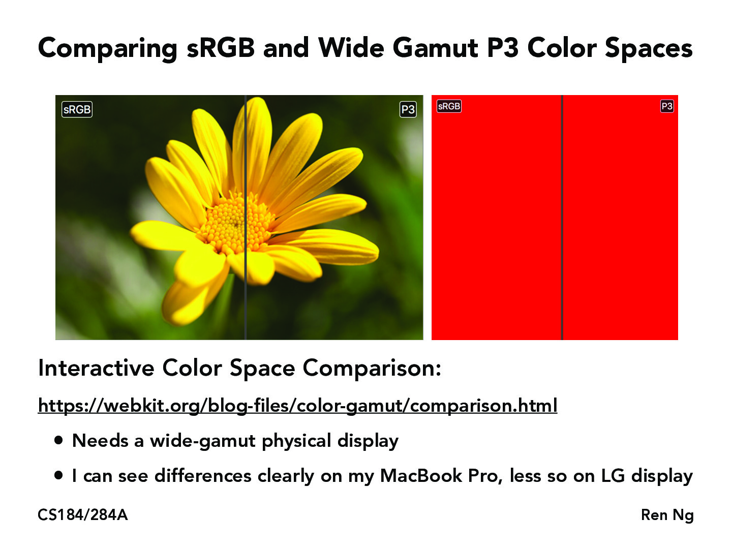
I don't really see the difference: https://webkit.org/blog-files/color-gamut/comparison.html
Can someone point it out to me?
To me P3 looks more saturated(vibrant) than sRGB
There is higher contrast and deeper blacks in P3 as it displays up to 25% more color depth.
@rsha256 Check the gamut of the display you are using. If it does not support P3, then you won't be able to see the difference because the display physically cannot show you those colors.
I can see the higher contrast/deeper blacks mentioned by estherc123 in the flower photo, but the two reds look the same to me; is that intended?
As other comments pointed out, the flower image in P3 looks more vibrant and has higher contrast. On the other hand, the two reds look the same. I believe this should be the case due to how the color red falls within the gamut of both color spaces; therefore can be accurately presented in both sRRB and P3.
Hmmm. I don't see differences either in the webpage image to the left. The red image should show a visible icon in the P3 version only.
Try downloading the PDF -- the differences are clear to me there.