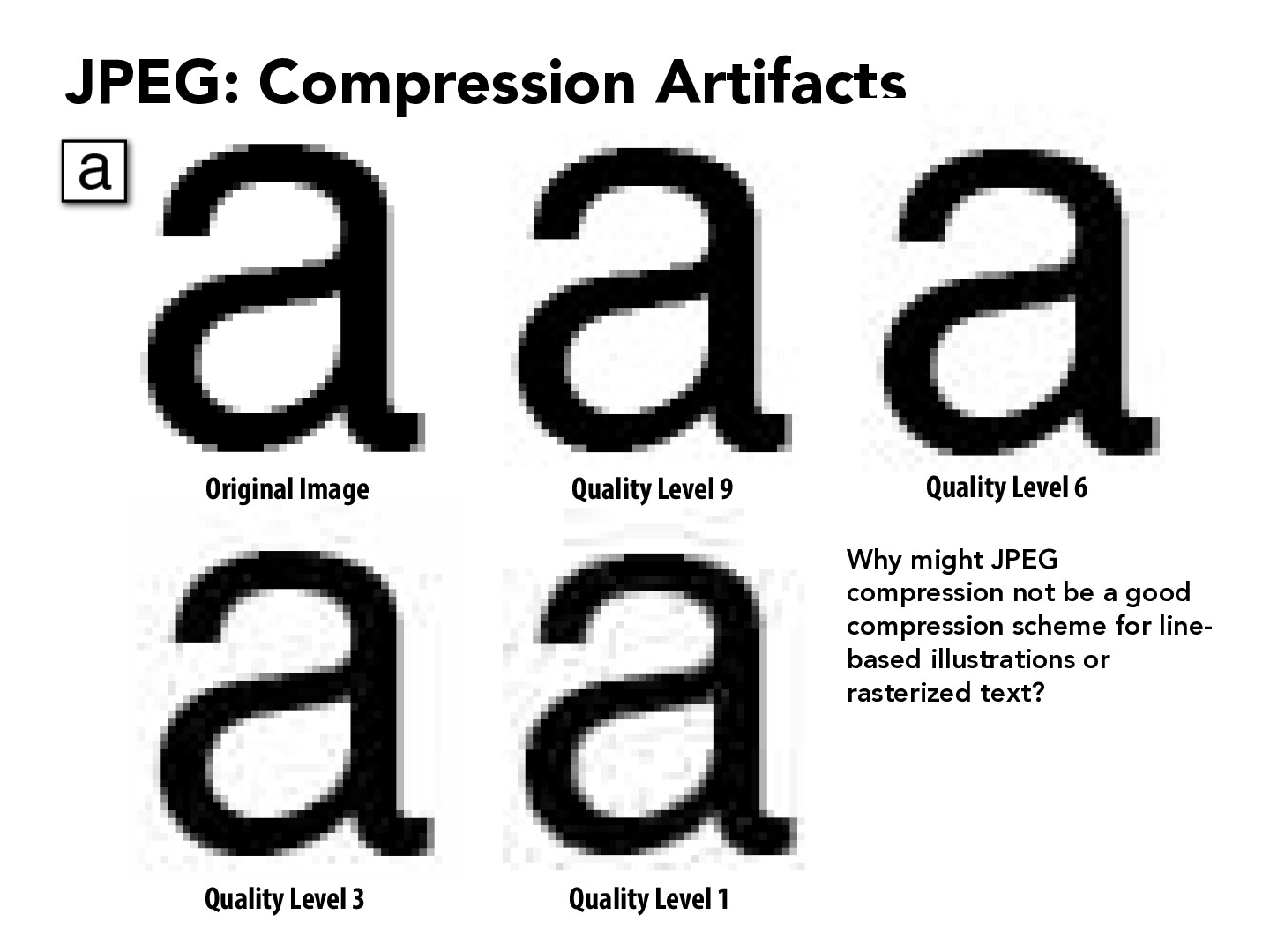
This is really interesting to me. I did not understand the difference between .png file and .jpeg files, but apparently it has to do with compression. I suppose it is probably not a good idea to compress meticulously designed images like characters or there will be a noticeable quality loss. I am not entirely sure how jpeg compression works (I am assuming a tree-structure), but the image seems mostly passable except for splotches of white in the "a" character as well as splotches of black in the white background. I wonder why that is and if there is a compression scheme that can minimize this for arbitrary characters and fonts.
jayc809
Probably the biggest reason for not using JPG or other pixel-based compression algorithms for fonts is because you would be setting a resolution/quality ceiling. In other words, if you zoom in deep enough, you we see visible jittering as opposed to the ideally smooth curves of characters. On advantage for vector-based approaches such as SVG files is that the position and appearance of each curve and reference points can be interpolated based on the zoom level and window location easily, which results in fonts that are always perfectly clear.
henrykhaung
Since JPEG compression discards high-frequency information such as sharp transitions and edges, perhaps that might be why it might not be good for line-based illustrations or rasterized text?
jacky-p
JPEG compression is most likely not a good compression scheme for line-based illustrations or rasterized text because JPEG compression focuses on errors in human vision which works for more "complicated" images. Similar to what @henrykhaung above mentions. Images with lines/text are simpler, for example on the slide we immediately notice the drop in quality on the white areas on the image due to the compression, but for more intricate images the drop in quality is not as quickly noticeable.
adam2451
Everyone is making valid points, JPEG was designed to take advantage of how we perceive color, and thus applying it to a black and white image is not a great compression scheme.
vivek3141
I find it interesting out in addition to poorly encoding high-frequency artifacts such as line-based illustrations or rasterized texts, JPEG is also introducing additional artifacts on the white background of the "a" here.
I suspect this is due to the lossy compression, but I can't actually pin-point why
noah-ku
This slide highlights the limitations of JPEG compression for line-based illustrations or rasterized text. The quality loss from JPEG's lossy compression becomes evident as the 'a' character, clear in the original image, blurs and develops a blocky appearance at lower quality levels. These artifacts disrupt the image's clarity, making JPEG unsuitable for content where sharp lines and text are essential. For maintaining detail in such images, lossless formats like PNG or TIFF are recommended over JPEG.
Liaminamerica2
I always used PNG instead of JPEG to store images because it could handle a transparent background. I found out there are cases in which they were each designed for such as PNG being ideal for images that require high-quality visual details like text, line art, and graphics due to its lossless compression, allowing for sharp edges and preservation of detail without degradation over multiple saves. On the other hand, JPEG is more suited for photographs and images with gradients, where file size is a concern and some loss of detail due to compression is acceptable for the sake of efficiency and speed in loading times, especially on the web.
anavmehta12
Since JPEG compression discards high frequency details of an image such as edges and lines and fonts are based on line illustrations as we compress the image the jaggies will be very evident and hard to read the fonts.
oligonagon
I also thought this was really interesting because I originally didn't know about this difference about JPEGs/JPGs. A site I found that explained more about the different file formats and when to use them: https://medium.com/hd-pro/jpeg-tiff-png-svg-file-formats-and-when-to-use-them-1b2cde4074d3
a video I found that explains JPEGs versus GIFs and PNGs and more: https://www.youtube.com/watch?v=ww12lImOJ38
aidangarde
Jpeg compression would be a bad scheme for line-based illustrations. Because a large part of the image requires high-frequency, and any deterioration is very noticeable, while other images like the image of a face are less noticeable because the frequencies are lower and a blurred line is less obvious.
zepluc
I am curious about difference between JPEG and PNG. When doing my homework, I tried to change the .jpeg picture manually to .png, and the picture still looks good. But when I was trying to render it as a texture, it failed. Why it happened?
myxamediyar
I wonder why JPG a lot of the times does not provide support for transparent pictures... I can imagine it's not terribly hard to just add a 4th dimension in the encoding. I guess it would look bad if not though through because of the noise and artifacts, but still not infeasible.
weinatalie
In response to myxamediyar, I believe that JPEGs only store information relating to RGB values and are missing the alpha channel, which relates to opacity. This is because the JPEG was created for photography, which would have no way of relaying opacity information. PNG, on the other hand, does store an alpha channel because it was created with digital graphics in mind. It would probably be difficult to add a 4th dimension retroactively because you would have to rework the compression algorithm to factor in the alpha information as well.
stang085
I think it's so interesting how there's a lot of jittering for level compared to the original image, since the compression seems like it wouldn't affect some of the areas that there appears to be noise
This is really interesting to me. I did not understand the difference between .png file and .jpeg files, but apparently it has to do with compression. I suppose it is probably not a good idea to compress meticulously designed images like characters or there will be a noticeable quality loss. I am not entirely sure how jpeg compression works (I am assuming a tree-structure), but the image seems mostly passable except for splotches of white in the "a" character as well as splotches of black in the white background. I wonder why that is and if there is a compression scheme that can minimize this for arbitrary characters and fonts.
Probably the biggest reason for not using JPG or other pixel-based compression algorithms for fonts is because you would be setting a resolution/quality ceiling. In other words, if you zoom in deep enough, you we see visible jittering as opposed to the ideally smooth curves of characters. On advantage for vector-based approaches such as SVG files is that the position and appearance of each curve and reference points can be interpolated based on the zoom level and window location easily, which results in fonts that are always perfectly clear.
Since JPEG compression discards high-frequency information such as sharp transitions and edges, perhaps that might be why it might not be good for line-based illustrations or rasterized text?
JPEG compression is most likely not a good compression scheme for line-based illustrations or rasterized text because JPEG compression focuses on errors in human vision which works for more "complicated" images. Similar to what @henrykhaung above mentions. Images with lines/text are simpler, for example on the slide we immediately notice the drop in quality on the white areas on the image due to the compression, but for more intricate images the drop in quality is not as quickly noticeable.
Everyone is making valid points, JPEG was designed to take advantage of how we perceive color, and thus applying it to a black and white image is not a great compression scheme.
I find it interesting out in addition to poorly encoding high-frequency artifacts such as line-based illustrations or rasterized texts, JPEG is also introducing additional artifacts on the white background of the "a" here.
I suspect this is due to the lossy compression, but I can't actually pin-point why
This slide highlights the limitations of JPEG compression for line-based illustrations or rasterized text. The quality loss from JPEG's lossy compression becomes evident as the 'a' character, clear in the original image, blurs and develops a blocky appearance at lower quality levels. These artifacts disrupt the image's clarity, making JPEG unsuitable for content where sharp lines and text are essential. For maintaining detail in such images, lossless formats like PNG or TIFF are recommended over JPEG.
I always used PNG instead of JPEG to store images because it could handle a transparent background. I found out there are cases in which they were each designed for such as PNG being ideal for images that require high-quality visual details like text, line art, and graphics due to its lossless compression, allowing for sharp edges and preservation of detail without degradation over multiple saves. On the other hand, JPEG is more suited for photographs and images with gradients, where file size is a concern and some loss of detail due to compression is acceptable for the sake of efficiency and speed in loading times, especially on the web.
Since JPEG compression discards high frequency details of an image such as edges and lines and fonts are based on line illustrations as we compress the image the jaggies will be very evident and hard to read the fonts.
I also thought this was really interesting because I originally didn't know about this difference about JPEGs/JPGs. A site I found that explained more about the different file formats and when to use them: https://medium.com/hd-pro/jpeg-tiff-png-svg-file-formats-and-when-to-use-them-1b2cde4074d3
a video I found that explains JPEGs versus GIFs and PNGs and more: https://www.youtube.com/watch?v=ww12lImOJ38
Jpeg compression would be a bad scheme for line-based illustrations. Because a large part of the image requires high-frequency, and any deterioration is very noticeable, while other images like the image of a face are less noticeable because the frequencies are lower and a blurred line is less obvious.
I am curious about difference between JPEG and PNG. When doing my homework, I tried to change the .jpeg picture manually to .png, and the picture still looks good. But when I was trying to render it as a texture, it failed. Why it happened?
I wonder why JPG a lot of the times does not provide support for transparent pictures... I can imagine it's not terribly hard to just add a 4th dimension in the encoding. I guess it would look bad if not though through because of the noise and artifacts, but still not infeasible.
In response to myxamediyar, I believe that JPEGs only store information relating to RGB values and are missing the alpha channel, which relates to opacity. This is because the JPEG was created for photography, which would have no way of relaying opacity information. PNG, on the other hand, does store an alpha channel because it was created with digital graphics in mind. It would probably be difficult to add a 4th dimension retroactively because you would have to rework the compression algorithm to factor in the alpha information as well.
I think it's so interesting how there's a lot of jittering for level compared to the original image, since the compression seems like it wouldn't affect some of the areas that there appears to be noise