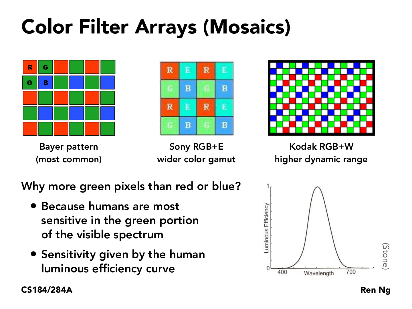
This theory, that we are more sensitive to green light is taken to heart by companies like fuji film who use even more green then the Bayer pattern. https://en.wikipedia.org/wiki/Fujifilm_X-Trans_sensor . Personally, as an owner of many Fuji cameras, you can instantly see the difference created by the pattern.
knguyen0811
I thought I'd also provide other variants such as:
CYYM - Used in a few Kodak cameras
CYGM - Used in a few Nikon and Canon cameras
The Kodak RGBW filter array in this slide also has two other variants, which are just rearrangements of the RGBW scheme. You can check out the other arrays here.
mishywangiepie
If humans are most sensitive to green wavelengths, wouldn't it make sense to have less green pixels so as not to overwhelm the other colors?
ayushsm
I think the idea here is that by including more green we can show which stuff we want humans to focus on. Based on your question, we probably achieve the same idea but just by doing the inverse (reducing the green amount in order to draw less attention to said area).
kavimehta
I'd be surprised if reduction in green would have the same effect. If do the inverse, then we significantly cut down on the amount of light humans would receive, and the picture quality would be far dimmer.
x-fa19
Agree with the above; reducing green would not be conducive. Picture quality would likely decrease, since the usage of green in the first place is for our eyes to capture more information -- the reason why our eyes are most sensitive to green light is because green light simultaneously stimulates two types out of the three cone cells: L and M, almost equally.
taoong
I understand why there are more green pixels than red or blue, but is a 2:1:1 ratio really the optimal way to represent images given how our eyes see color? I'm wondering which pixel mapping is technically most accurate since the human luminous efficiency curve doesn't seem to be as simple as 2:1:1 might suggest.
upasanachatterjee
@taoong i think you're right, perhaps it's because of efficiency? It seems like it'd be easier to render if there's 2:1:1, there would be less overall work done than with a more complicated set up
randyfan
The Bayer pattern has more green than red/blue pixels because Bayer considered the G channel as luminance and the RB channels as chrominance. This is because for some reason the RB channels don’t provide sufficient information on luminance. Also, the largest part of the RGB gamut is green (cyan, yellow, green, etc.). Since the human eye is sensitive to these shades of green the Bayer pattern helps convey realistic color. If we used an equal fraction of red, green, blue, the image would appear more noisy.(https://www.cambridgeincolour.com/tutorials/camera-sensors.htm)
CptTeddy
I've always doubted whether the claim that green color causes less eye strain is true. Given the discussion here, I think it's understandable if the green color actually relaxes our eyes since, "in short, the eye is constructed such that it is easiest to focus on the green light, which is in the middle of the visible spectrum and has the strongest receptors." Reference to a more detailed discussion can be found here: https://skeptics.stackexchange.com/questions/17161/does-green-cause-less-eye-strain.
AnastasiaMegabit
I was just asking about this on last week's slides. So the reason for more green is because we are more sensitive to green. Then is this a factor in why the Samsung pixel layout is superior to the Apple layout? The apple layout seemed to just have the rgb broken up into three columns of the same size per pixel, which means no additional green.
This theory, that we are more sensitive to green light is taken to heart by companies like fuji film who use even more green then the Bayer pattern. https://en.wikipedia.org/wiki/Fujifilm_X-Trans_sensor . Personally, as an owner of many Fuji cameras, you can instantly see the difference created by the pattern.
I thought I'd also provide other variants such as:
The Kodak RGBW filter array in this slide also has two other variants, which are just rearrangements of the RGBW scheme. You can check out the other arrays here.
If humans are most sensitive to green wavelengths, wouldn't it make sense to have less green pixels so as not to overwhelm the other colors?
I think the idea here is that by including more green we can show which stuff we want humans to focus on. Based on your question, we probably achieve the same idea but just by doing the inverse (reducing the green amount in order to draw less attention to said area).
I'd be surprised if reduction in green would have the same effect. If do the inverse, then we significantly cut down on the amount of light humans would receive, and the picture quality would be far dimmer.
Agree with the above; reducing green would not be conducive. Picture quality would likely decrease, since the usage of green in the first place is for our eyes to capture more information -- the reason why our eyes are most sensitive to green light is because green light simultaneously stimulates two types out of the three cone cells: L and M, almost equally.
I understand why there are more green pixels than red or blue, but is a 2:1:1 ratio really the optimal way to represent images given how our eyes see color? I'm wondering which pixel mapping is technically most accurate since the human luminous efficiency curve doesn't seem to be as simple as 2:1:1 might suggest.
@taoong i think you're right, perhaps it's because of efficiency? It seems like it'd be easier to render if there's 2:1:1, there would be less overall work done than with a more complicated set up
The Bayer pattern has more green than red/blue pixels because Bayer considered the G channel as luminance and the RB channels as chrominance. This is because for some reason the RB channels don’t provide sufficient information on luminance. Also, the largest part of the RGB gamut is green (cyan, yellow, green, etc.). Since the human eye is sensitive to these shades of green the Bayer pattern helps convey realistic color. If we used an equal fraction of red, green, blue, the image would appear more noisy.(https://www.cambridgeincolour.com/tutorials/camera-sensors.htm)
I've always doubted whether the claim that green color causes less eye strain is true. Given the discussion here, I think it's understandable if the green color actually relaxes our eyes since, "in short, the eye is constructed such that it is easiest to focus on the green light, which is in the middle of the visible spectrum and has the strongest receptors." Reference to a more detailed discussion can be found here: https://skeptics.stackexchange.com/questions/17161/does-green-cause-less-eye-strain.
I was just asking about this on last week's slides. So the reason for more green is because we are more sensitive to green. Then is this a factor in why the Samsung pixel layout is superior to the Apple layout? The apple layout seemed to just have the rgb broken up into three columns of the same size per pixel, which means no additional green.